Dashboard Interface Design
This project is constructed to introduce us to UX/UI (user experience/user interface) tools and thought processes. We were to design a dashboard in order to solve a self-directed problem. Throughout the process, we were tasked with keeping the ‘4’ C’s of interface design: color, contrast, content, and continuity.
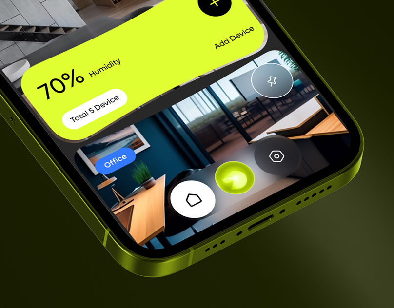
I often find dashboards to be cluttered with information or lack the necessary wording to understand what I am looking at. I challenged myself to incorporate imagery as a communication device and keep minimal wording in the project.
I suppose I have been working on this idea for years in a way. I wanted my dashboard to function well for those with ADHD or others who are executive functioning impaired. Most dashboards I researched were data driven. I spent some time reading about what helps one stay on task. I read several testimonials on Reddit from ADHDers who have found ways to gamify their lives. Particularly, u/mastergeese spoke about the need to be able to assign values to tasks based on likelihood to complete the task, the consequences of not completing them, task difficulty, and avoidance probability regardless of reward. I borrowed many ideas from the r/ADHD Gamifying Tasks thread. I then thought about how those would best benefit my kid and the things in his life he needs to balance.


I decided the system would consist of four main categories: school, work, health, and fun. Reaching short term goals would trigger a reward, but reaching long term goals would trigger an actual reward the parent could give, such as a present or extended curfew. There would also be a monitoring function that would offer encouragement for improving after a bad day. The dashboard would also include a rating system that could be seen for each of the four compartments. As well as a Bluetooth tag system that allowed the user to click a button next to their medicine instead of needing to have a phone present to do so.


My dashboard was created to address the very real need for myself as a parent to help guide my child with ADHD. A common occurrence is not quite completing a task. If the task involved three steps, it is likely that steps one and two would be completed perfectly, but step three may not quite make it over the finish line. The dashboard needed to function mainly as a quick glance information center and not require much input from my child. I would use color to highlight information and grayscale to mute tasks that did not need immediate attention.
I used light and dark shades of gray to build the medium-fi wireframe. I relied on visual hierarchy to highlight the larger reward system (ribbon) and the highest priority compartment/widget, (school). In the widget for work, I included a check that is intended to be animated by filling it out in a script typeface as if a person were writing a check. I tried to incorporate the script elsewhere in the dashboard, but none were especially successful. Geometric typefaces tend to be appealing to me, but I thought it very important to use one in this instance due to the repetition of circles and rectangular elements throughout the design. I was able to incorporate the concept of handwriting through the use of the marker brush as a stroke on the chosen icons. I did spend a considerable amount of time attempting to illustrate my own set of icons, as I didn’t see an available pack for the variety I would need to make use of. In the end, I sourced different packs to find the most cohesive set I could.


With a system that is weighted and tailored for the user, the user would need minimal learning to understand the dashboard. Each widget would highlight what needs to be done at any given moment. For example, in the school compartment, each button is colored for January 29 and January 30. (The current date is indicated in the upper left-hand corner and is the 29th.) These tasks need to be considered the highest priority. The colors do not change once a task is completed, but rather add the addition of a complementary color to help illuminate accomplishment. While the dashboard covers a wide breadth of information, the user will be able to glance at it for quick organization of tasks.

The reward system is three fold. The color acts as the first indicator of accomplishment. Each widget has a second layer that will offer music, trivia, animation, or confetti once all daily goals have been waived. The final reward comes weekly and will be tied to the user's guardian.


In the medicine widget, there are three areas of focus: dental hygiene (mouth), sleep hygiene (rooster), and medication (pill). This compartment is dual operated using Bluetooth tags and the tap button option. The number of buttons indicates the time each task needs to be completed in a day. The change in color indicates an accomplished task. Once each button in an area of focus is pressed, it will trigger an animation that introduces the user to a new song.

This project was unique for me in that by the second sketch, it was so clear what this project would look like that it didn’t change very much. Due to time constraints, I left out a few smaller elements that were more personal and was able to do so without compromising each widget’s functionality.
I found this project a great challenge, and a kind I am increasingly interested in. I enjoy the task of condensing and disseminating a large amount of information. I also find I want to use Illustrator to build more and more. I worked with the Shapes Tool, Pathfinder, and Brushes, all of which I consider myself a novice. I found XD to be a very challenging program to translate my dashboard to life. I believe this was due to thinking about my dashboard as having minimal interaction, such as buttons or scroll bars, rather than building out a functioning button. I learned that working on new programs should be something I schedule to happen earlier in the day so that I have more capacity to retain information. The most useful bit of information I acquired was taking the time to step away from the concept of any multi-platform project and look at it through the lens of the user.